In today’s digital age, visual content has become an essential tool for businesses to effectively communicate their message and engage with their audience. One of the most powerful forms of visual content is animated charts, which not only make data more visually appealing but also help in conveying complex information in a simplified manner. However, like any other tool, animated charts need to be used strategically and thoughtfully to have maximum impact. In this article, we will discuss the best practices for using animated charts in your digital content to ensure they are effective and engaging.
What are the Best Practices for Animated Charts?
When it comes to using animated charts, there are certain golden rules that should always be kept in mind to ensure their effectiveness. These best practices not only help in creating visually appealing charts but also aid in conveying the intended message to the audience. Let’s take a look at some of these best practices in detail.
Animation Speed
One of the major perks of using animated charts is that they allow you to control the pace of information flow. This means you can guide your audience’s eyes to critical information and highlight important data points. However, if animation speed is not carefully considered, it can quickly cause confusion and overwhelm the audience. So, what is the optimal speed for animated charts?
According to research, the ideal animation speed for charts is between 200 and 500 milliseconds (ms). Any faster than 200 ms, and the audience may not even notice the animation, making it ineffective. On the other hand, anything slower than 500 ms can create a sense of delay and bore the audience. However, it is important to note that this speed may vary based on the nature of your animation or the context it sits in. Therefore, it is crucial to use your own judgment and find the optimum speed that works for your specific chart.
To give you a better understanding, let’s take a look at an example. Say you are creating an animated bar chart to showcase the sales performance of your company over the past year. In this case, you can use a speed of 200 ms to animate the bars appearing one by one, drawing the audience’s attention to each month’s sales figures. On the other hand, if you are creating a line graph to show the trend of website traffic over the past year, a slower speed of 500 ms may be more suitable to give the audience time to absorb the information and understand the trend.
Keep It Simple
When it comes to data visualization, less is often more. It is important to be selective with the data you decide to highlight in your animated charts. Don’t include every single data point just because the format allows you to do so. This will only saturate your chart with too much information, making it overwhelming for the audience to comprehend.
Instead, focus on including data that is important and relevant to your audience. This could be data that helps you convey a specific point or gives a visual overview of trends. Including too much data can also make your chart cluttered and difficult to read, defeating the purpose of using an animated chart in the first place. So, keep it simple and only include what is necessary to effectively communicate your message.
Maintain the Overall Design
While animated charts add an element of movement and interest to your digital content, it is crucial to maintain the overall design of your chart. This means keeping the color scheme, font, and other design elements consistent throughout the animation. Inconsistency in design can be distracting and take away from the message you are trying to convey.
Moreover, it is important to ensure that the animation does not overshadow the data itself. The purpose of using animated charts is to make data more visually appealing and easier to understand, not to make it difficult to read. Therefore, the design should always support the data and not overpower it.
Provide Context
Another important aspect to consider when using animated charts is providing context to your audience. While the animation may make the data more engaging, it is important to remember that it is just one part of the overall story. Without proper context, the audience may not fully understand the significance of the data being presented.
One way to provide context is by adding annotations to your chart. These could be labels, arrows, or text boxes that explain the data points and their significance. For instance, if you are showing an increase in sales over the past year, you can add an annotation explaining the reason behind this growth, such as a new marketing strategy or product launch.
Another way to provide context is by using multiple charts together to tell a complete story. For example, you can use a bar chart to show the sales performance and a line graph to show the trend over time. This will give the audience a better understanding of the data and its significance.
What are the Top Five Applications to Unveil?
Having walked through the theoretical aspects of animated charts, let’s now delve into the real-world examples. In this segment, we’ll unravel some of the most fascinating uses of animated charts which effectively demonstrate the dynamic nature and efficacy of this form of data storytelling. We’ll also explore the varied design techniques to incorporate into your data visualization journey.
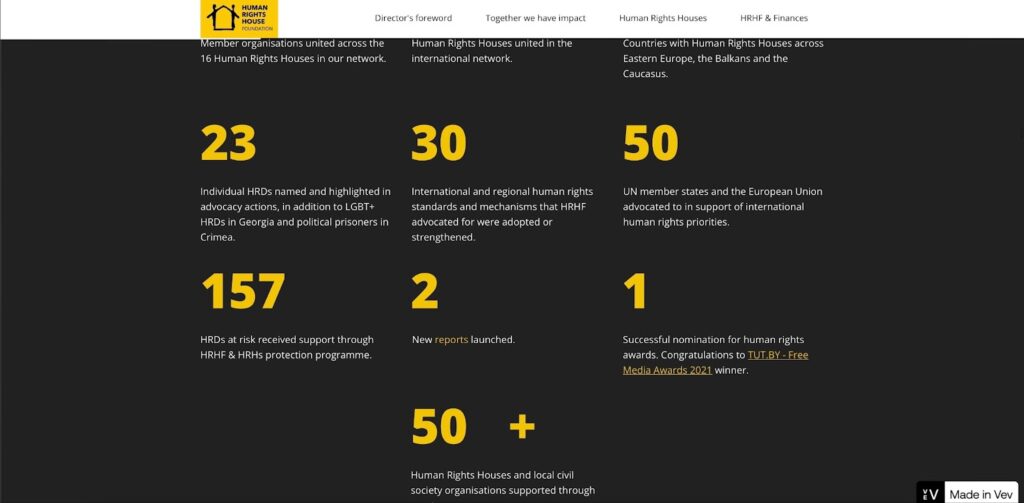
Human Rights House Foundation’s Annual Report
Renowned non-profit, Human Rights House Foundation, released its annual report displaying an impressive exhibit of diverse data visualization techniques. It includes interactive maps, animated counters, and our focus for today, animated charts, designed with Vev. These charts not only retain reader interest but also make the interpretation of complex data a breeze.
Their first animated donut chart portrays the organization’s revenue. As each part of the donut chart emerges while you scroll, it lucidly depicts the revenue distribution per donor. Another animated chart, distinguished by its yellow color, vividly shows the organization’s expense allocation.
The horizontal bar chart, showcasing the distribution of expenses across various organizational objectives, also deserves a special mention. This chart, in striking contrasting colors, highlights how each category impacts different plans and objectives of Human Rights House.
ServiceNow’s Sustainability Advantage Infographic
ServiceNow’s visually appealing infographic titled “The Sustainability Advantage”, incorporates engaging animated charts to illustrate the growth in environmental, social, and governance (ESG) frameworks. This infographic, designed with Vev, leverages colorful animated charts for effective communication.
A graph representing the fluctuating trust levels in various industries like telecommunications, energy, financial services, and tech is one such example. Each industry being represented by a unique color, the charts spring to life as readers scroll, demonstrating that tech is the only sector where trust levels are dwindling.
Another interesting donut chart reveals the scarcity of ESG management experience most boards face, made evident as the chart changes color when scrolled.

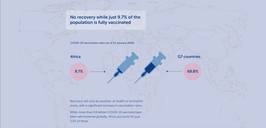
Mo Ibrahim Foundation’s Creative Research on COVID in Africa
Easing the understanding of complex data, animated charts have played a pivotal role in representing COVID-19 related stats. The Mo Ibrahim Foundation’s creative Vev-based research on COVID in Africa exemplifies this.
Opting for a less conventional approach, they used simple illustrations to convey data about vaccine needs in Africa. As the reader scrolls, two animated bottles that signify Africa’s 25% global vaccine demand and 99% vaccine import fill up, making the disparity strikingly evident.
The animations coupled with the illustrative aspect of these charts not only enhance reader engagement but also stress the significance of the data presented.
United Nations Office on Drugs & Crime’s Synthetic Drug Report
The UNODC’s strategy on synthetic drugs showcases an outstanding data-centric interactive infographic that employs animated charts to relay an extensive pool of information. Assisted by clear visualizations, the reader can comprehend the massive data without feeling inundated.
The report uses a column chart for representing a decade-long growth in amphetamine seizures worldwide. The numbers rise in rhythm with the scrolling, leaving an emphatic impression about the rising drug seizures.
Further scrolling unravels a donut chart on global methamphetamine quantities seized and additional column charts on the prevalence and cost of other synthetic drugs. Together, these dynamic visuals expedite the reader’s quick scan of key information.
Rightcolours’ Animated Infographic on Global Air Traffic
Rightcolours, a German creative communications agency, produced an intriguing animated video infographic on global air traffic. Leveraging animated charts along with video data visualization, this content takes information sharing to an entirely new plane.
Conclusion
In conclusion, animated charts can be a powerful tool in your digital content strategy if used correctly. By following these best practices, you can ensure that your animated charts are effective in conveying your message and engaging with your audience. Remember to pay attention to animation speed, keep it simple, maintain consistency in design, and provide context to make the most impact with your animated charts. With the right approach, animated charts can enhance your data visualization and take your digital content to the next level.