Google Fonts offers an extensive collection of top-notch fonts suitable for a variety of web projects, all available at no charge. Below, you’ll find a curated selection of 10 font combinations aimed at elevating the design of your upcoming website.
Font Combinations Explained
The art of pairing typefaces involves strategically using two distinct fonts to enhance the overall aesthetic and functionality of a design. This approach is pivotal in establishing a unique visual identity for web design projects, enabling the conveyance of specific brand personalities or adding a creative twist to text elements like headlines.
However, the process of selecting the right font duo requires careful consideration. Not all typefaces work well together; a font that is impactful for titles might prove difficult to read in longer text blocks, detracting from the user experience. Choosing fonts that complement each other is crucial to maintaining harmony in your design and avoiding a discordant appearance.
Using Google Fonts for Effective Font Pairings
Utilizing Google Font combinations can significantly enhance the visual appeal and readability of your designs. While the choice of fonts may vary depending on the specific design requirements, there are some general guidelines to consider.
- Firstly, it’s advisable to select a distinct “header” typeface for your H1, H2, and even H3 tags. This primary typeface should capture the reader’s attention and effectively highlight different sections of your content;
- For the second typeface, primarily designated for body copy or smaller heading tags like H4 and H5, prioritize readability. Opt for a font that remains legible even when used in smaller sizes, particularly crucial for articles or blogs where lengthy passages of text are common.
Pairing Options for the Montserrat Typeface
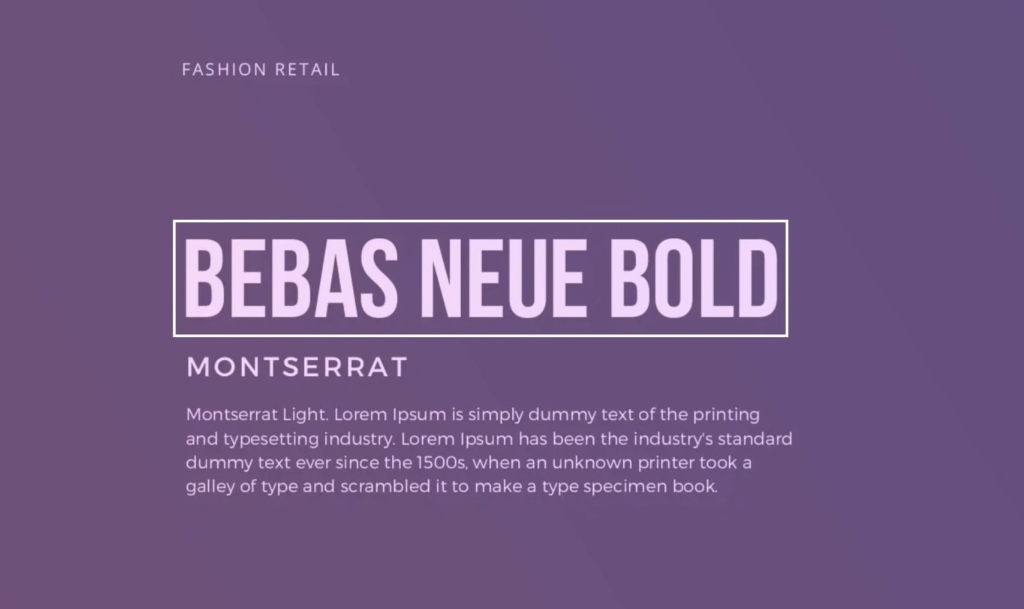
Let’s begin by presenting our inaugural font collection, Montserrat. This robust sans-serif typeface boasts an impressive array of 18 distinct font variations. Additionally, it is complemented by two companion font families, Alternates and Subrayada, providing you with a plethora of options. Within this piece, our focus will be on the foundational Montserrat font family, elucidating the most effective pairings that harmonize with its versatile design.
Montserrat + Cabin
Cabin is a humanist sans-serif typeface that meshes well with the Montserrat family. Named for their emulation of the nuanced, handcrafted appearance, humanist sans-serif fonts retain a structured and contemporary feel. They exhibit a more natural structure compared to the more conventional sans-serif fonts, striking a balance between organic appeal and modern design.
Montserrat + Inconsolata
Inconsolata stands out as a monospace font, crafted with the clarity of printed code listings in mind. This typeface draws its inspiration from fonts favored by programmers, ensuring legibility on both print and screens. With its design optimized for readability, Inconsolata guarantees an effortless reading experience on your digital platform.
Montserrat + Source Sans Pro
Source Sans Pro, the inaugural open-source typeface family from Adobe, is a sans-serif font crafted with user interfaces as its primary application. This typeface is designed to enhance legibility and usability in digital environments, making it an ideal companion for Montserrat in user-centric designs.
Montserrat + Source Code Pro
Source Code Pro is a variant within the Adobe Source typeface collection, tailored to pair with Source Sans Pro by transitioning into a monospace format suitable for coding purposes. This adaptation is specifically engineered for application in programming environments, reflecting its purpose in its very name.
Montserrat + Barlow
Barlow is a sans-serif typeface with subtle rounded edges, offering a gentler aesthetic to your designs. Inspired by the distinctive visual culture of California, Barlow evokes the look of the state’s license plates, highway signage, and public transportation, making it a perfect match for Montserrat in creating designs with a touch of Californian flair.
Discover Ideal Combinations with Lato Fonts

Explore the versatility of Lato, a sleek sans-serif font offering 10 distinct weights. Crafted by Polish designer Łukasz Dziedzic, Lato emerged in 2010 and has steadily gained traction in the design community. Initially developed as corporate fonts for a major client, the typeface transitioned to public availability, offering a stylish and adaptable option for various design projects.
Lato + Karla
Karla, a member of the grotesque sans-serif family, doesn’t earn its name from being unattractive; rather, it’s a reference to the sans serif fonts that emerged around 1815. In this context, Karla offers a contemporary twist on the styles of that era. Designed by Jonny Pinhorn, the same creative mind behind Shrikhand, Karla brings a fresh perspective to modern typography.
Lato + Merriweather
Introducing Merriweather, a serif font tailored for effortless on-screen reading. Boasting a generous x-height, Merriweather pairs seamlessly with Lato, serving as an ideal choice for both headers and body text thanks to its legible design.
Lato + Vollkorn
Vollkorn, designed by German typographer Friedrich Althausen, embodies understated elegance and versatility. Released in 2005, Vollkorn swiftly gained popularity, finding its way into countless web and print projects. Pronounced “Follkorn,” this high-quality serif typeface is equally adept at handling body copy as it is at commanding attention in headlines and titles.
Lato + Arvo
Embrace the distinctive with Arvo, a geometric slab-serif typeface family meticulously crafted for both digital and print mediums. Slab-serif fonts, characterized by their robust and block-like serifs, have a historical association with small print, such as typewritten text. The bold serifs of Arvo ensure clarity and readability even at smaller sizes, making it a versatile choice for various design applications.
Lato + Noto Serif
Enter the world of global typography with Noto, a comprehensive font collection designed to support writing in modern and ancient languages worldwide. Among its diverse styles, we focus on Noto Serif, chosen specifically to complement Lato. The interplay of serif and sans-serif fonts brings a dynamic contrast to your design, enhancing its visual impact and readability.
The Impact of Thoughtful Font Combinations in Web Design
In the world of web design, font choices often take a backseat. However, they play a crucial role, just like layout and imagery. A visually stunning design can lose its charm if the fonts used are difficult to read.
When engaging in web design projects, it’s crucial to carefully assess your font selections:
- Ensure the header captures attention effectively;
- Prioritize readability for the body text;
- Strive for font styles that harmonize rather than clash;
- Opt for fonts that stand out and leave an impression.
Conclusion
Selecting the right font pairings is an art that can significantly enhance your web design. A well-paired duo makes your content more readable and aesthetically pleasing, contributing to an improved user experience. Remember, a great design isn’t just about the images and layout, but the font choices also play a crucial role. With Google Fonts offering an extensive range of typefaces, you are all set to elevate your next web project with the right font combination.