Every day, our eyes are bombarded with a myriad of fonts, right from the digital news articles we consume to the roadside billboards we encounter on our commute to work. Some of these fonts make an indelible impact and persist in our memory while others, that fail to resonate, quickly fade away. But what is the underlying factor that renders a font successful or unsuccessful? The key lies in understanding the psychology of fonts.
What is Font Psychology?
Every day, our eyes skim across countless fonts – from the digital news we consume to the roadside billboards we encounter on our daily commute. Some typefaces resonate with us, embedding themselves into the corners of our memory, while others evaporate almost instantly. But what separates a potent, effective font from an ineffective one? The secret lies at the convergence of typography and cognitive science, in a realm known as font psychology.
Decoding Font Psychology
Font psychology refers to our emotional and visual responses to specific typefaces. This field of study is grounded in the Rule of Personal Communication theory by Albert Mehrabian, which suggests that 93% of personal connection is non-verbal, emphasizing the need to communicate ideas and values as efficiently as possible. Our feelings, thoughts, and actions can be profoundly influenced by the type of font we’re exposed to.
A psychological model often invoked to dissect font perception is the Kolenda Font Model. This model details how individuals associate specific traits with different fonts. For example, a company promoting physical strength may use a bold font for its branding. The robustness of the font subtly conveys connotations of intensity and power, thereby influencing the consumer’s perception of the brand.
Understanding Typography
Before we delve deeper into the world of fonts and their associated connotations, it’s crucial to grasp the basic rules and principles of typography. In brief, typography is the art of arranging letters and text in a way that both appeals visually and furthers understanding. Your choice of typography can significantly impact font psychology; whether you’re looking to evoke a sense of elegance with slender characters or a sense of authority with capitalized letters, typography can subtly alter an individual’s perception of your brand or message.
The Psychology of Shape and Color
Another key factor to consider when selecting a font is the psychology of shape and color. Shape psychology focuses on the emotional responses elicited by different geometric forms. This certainly applies to fonts, as they can employ various shapes through their design. Circular shapes in typefaces might produce a sense of calm and comfort, while sharp lines might evoke feelings of dynamism or aggression.
Color psychology, on the other hand, focuses on the emotional responses associated with different hues. A judicious selection of color can shift moods, providing a myriad of possibilities for font selection and design. Applying knowledge of shape and color psychology can empower designers to craft a font that accurately conveys their brand’s ethos.
How Can We Harness the Power of Font Psychology?
The essence of font psychology rests in its ability to subtly influence perceptions, attitudes, and even actions. By gaining insight into how audiences respond to various typefaces, businesses can wield this powerful tool to shape how their brand or designs are perceived.
A successful design is always goal-oriented and using font psychology cleverly can get the message across powerfully. Whether a design aims to boost retail sales during a quickfire promotional event or seeks to foster sustained user engagement on social media, the strategic selection of fonts can supercharge that message. Evoking emotions such as excitement, trust, and anticipation are key in nudging customers towards desired actions.
However, it’s equally crucial to avoid incorrect font choices that could lead to disastrous implications. A misaligned font choice can make even the most meticulous of design plans fall flat, creating a disconnect between the intended message and the perceived message.
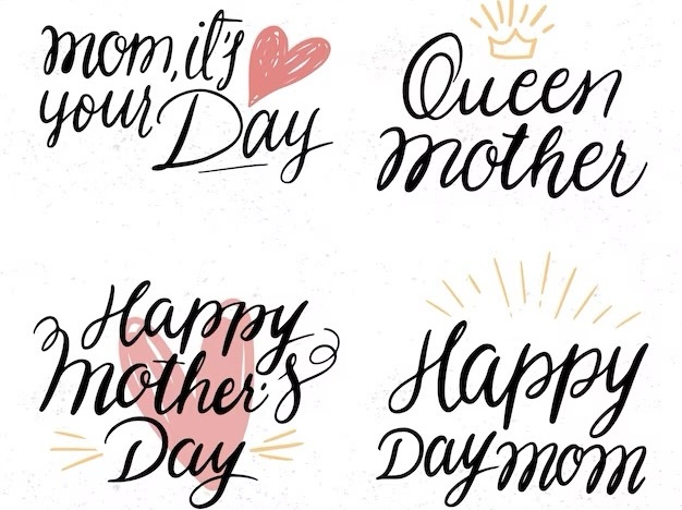
Consider, for instance, a marketing campaign for a Mother’s Day gift sale. A heartwarming commercial has been created, and the products are attractively packaged, ready to stir strong emotions of nostalgia and warmth. But if the posters and advertisements use a font like Georgia, known for its authoritative and stately connotations, it clashes with the emotional resonance of the campaign. The desired feelings of love, affection, and nostalgia are replaced with a sense of grandeur – an emotion that doesn’t quite align with the spirit of Mother’s Day.
What is the Significance of Font Psychology in Different Types of Fonts?
Now that we understand the importance of font psychology, let’s take a closer look at the different types of fonts and the meanings associated with them.
Serif Fonts
Serif fonts are characterized by small lines or “feet” at the end of each letter. They are often seen as traditional, formal, and authoritative. These fonts are commonly used in print media such as newspapers and books, as they are considered easier to read in large blocks of text. Some popular serif fonts include Times New Roman, Georgia, and Baskerville.
Pros:
- Easy to read in large blocks of text;
- Conveys a sense of tradition and authority;
- Can be used to create a classic and elegant look.
Cons:
- May not be suitable for digital platforms;
- Can appear outdated or old-fashioned;
- May not convey a modern or playful tone.
Slab Serif Fonts
Slab serif fonts are similar to serif fonts, but with thicker and more pronounced “feet”. They are often associated with strength, stability, and masculinity. These fonts are commonly used in logos and headlines, as they make a bold statement. Some popular slab serif fonts include Rockwell, Courier, and Clarendon.
Pros:
- Conveys a sense of strength and stability;
- Can make a bold statement;
- Suitable for both print and digital platforms.
Cons:
- May not be suitable for large blocks of text;
- Can appear too heavy or overpowering;
- May not convey a feminine or delicate tone.
Sans Serif Fonts
Sans serif fonts do not have the small lines or “feet” at the end of each letter. They are often seen as modern, clean, and minimalistic. These fonts are commonly used in digital platforms such as websites and social media, as they are considered easier to read on screens. Some popular sans serif fonts include Helvetica, Arial, and Futura.
Pros:
- Easy to read on digital platforms;
- Conveys a modern and clean look;
- Suitable for both print and digital platforms.
Cons:
- May not be suitable for formal or traditional designs;
- Can appear too plain or generic;
- May not convey a sense of warmth or personality.
Script Fonts
Script fonts mimic handwriting and are often associated with elegance, femininity, and creativity. These fonts are commonly used in invitations, logos, and branding materials. Some popular script fonts include Brush Script, Lobster, and Pacifico.
Pros:
- Conveys a sense of elegance and creativity;
- Adds a personal touch to designs;
- Suitable for both print and digital platforms.
Cons:
- May not be suitable for large blocks of text;
- Can be difficult to read in smaller sizes;
- May not convey a sense of masculinity or strength.
Modern Fonts
Modern fonts are characterized by their clean lines and geometric shapes. They are often associated with innovation, progress, and sophistication. These fonts are commonly used in technology and fashion industries. Some popular modern fonts include Futura, Avant Garde, and Century Gothic.
Pros:
- Conveys a sense of innovation and progress;
- Suitable for both print and digital platforms;
- Can make a bold statement.
Cons:
- May not be suitable for traditional or formal designs;
- Can appear too cold or impersonal;
- May not convey a sense of warmth or playfulness.
Display Fonts
Display fonts are decorative and eye-catching. They are often used in headlines, logos, and branding materials to make a strong visual impact. These fonts come in various styles and can convey different meanings depending on the design. Some popular display fonts include Impact, Bebas Neue, and Lobster.
Pros:
- Makes a strong visual impact;
- Adds personality to designs;
- Suitable for both print and digital platforms.
Cons:
- May not be suitable for large blocks of text;
- Can be difficult to read in smaller sizes;
- May not convey a sense of professionalism or formality.
Conclusion
In conclusion, font psychology plays a crucial role in how we perceive and react to different fonts. By understanding the power of typography and the meanings associated with different fonts, businesses, and brands can effectively communicate their message and connect with their target audience. It is important to carefully consider the use of font in designs and branding to create a strong and consistent brand identity. So the next time you choose a font for your design, remember to consider its shape, color, and meaning to make a lasting impression.