Google Fonts has become a go-to resource for designers and developers when it comes to choosing fonts for their projects. With over 900 font families available, it offers a wide range of options for creating visually appealing and professional-looking websites and designs.
But with so many choices, it can be overwhelming to find the perfect Google font combinations that will work well together. In this ultimate guide, we’ll break down everything you need to know about Google fonts and how to pair them effectively to create stunning designs.
Can Google Fonts be Understood?
Before diving into the world of Google font combinations, let’s first understand what Google Fonts is all about. Launched in 2010, Google Fonts is a free and open-source directory of web fonts that anyone can use for personal or commercial purposes.
It was created with the goal of making web typography accessible to everyone by providing a wide range of quality fonts that are easy to implement on websites. All the fonts on Google Fonts are carefully selected and optimized for web use, making them a popular choice among designers and developers.
Google Fonts also offers advanced features, such as font families with multiple weights and styles, support for multiple languages, and the ability to self-host fonts for faster loading times. With its user-friendly interface and extensive library, it has become a top choice for finding fonts for both print and digital design projects.
Now that we have a better understanding of Google Fonts, let’s dive into the world of font combinations.
The Basics of Font Pairing
Font pairing is the process of combining two or more fonts in a design project to create a cohesive and harmonious look. It involves selecting fonts that complement each other and work well together to convey a specific message or visual aesthetic.
When it comes to font pairing, there are a few key elements to consider. These include contrast, hierarchy, and readability.
Contrast
Contrast is an essential aspect of font pairing as it helps create visual interest and hierarchy in a design. It refers to the difference between two or more fonts in terms of their weight, size, and style. The greater the contrast, the more visually appealing and attention-grabbing your design will be.
For example, combining a bold and heavy font with a light and delicate one creates a striking contrast that can make your design stand out. On the other hand, using two similar fonts with little contrast can result in a monotonous and dull design.
Hierarchy
Font pairing is also about creating a clear hierarchy in your design by using different font styles and sizes for different elements. For instance, using a larger and bolder font for headings and a smaller and lighter one for body text helps distinguish between the two and makes your overall design more organized and structured.
Readability
No matter how aesthetically pleasing your font combinations may be, they won’t serve their purpose if they are not legible. Readability is crucial when choosing font combinations, especially for body text. Make sure to select fonts that are easy to read and have good spacing between letters and lines.
Now that we’ve covered the basics of font pairing let’s explore some popular Google font combinations.
Are there popular Google font combinations?
With over 900 font families available on Google Fonts, there are endless possibilities for font combinations. However, some combinations have become go-to choices for designers due to their versatility and effectiveness in various design projects.
Here are six top Google font combinations that you can use in your next project:
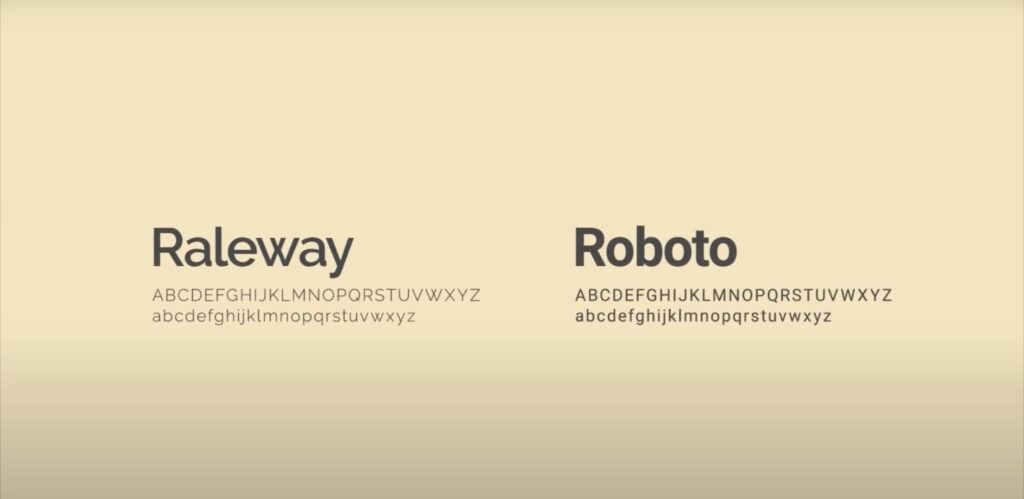
1. Roboto & Lora
Roboto and Lora are two popular serif and sans-serif fonts that work exceptionally well together. The simplicity of Roboto’s geometric forms paired with the elegance of Lora’s serifs creates a perfect balance between modern and traditional styles.
Why It Works
- The contrast between the sans-serif and serif fonts creates a modern and classic contrast, making the design visually appealing;
- Both fonts have multiple weights and styles to choose from, allowing for flexibility in creating hierarchies;
- Roboto’s clean and minimalistic design complements Lora’s elegant and sophisticated look;
- Both fonts are highly legible, making them suitable for body text and headings.
2. Montserrat & Merriweather
Montserrat and Merriweather are two versatile and widely used fonts that make a perfect pairing for any design project. Montserrat’s geometric forms paired with Merriweather’s traditional serifs create a contemporary yet classic look that can work well in various designs.
Why It Works
- The combination of a sans-serif and a serif font creates a balanced and harmonious design;
- Both fonts have a wide range of weights and styles to choose from, making it easy to create visual hierarchy in a design;
- Montserrat’s bold and condensed design pairs well with Merriweather’s lighter and more spacious look;
- Both fonts have excellent readability and work well for both body text and headings.
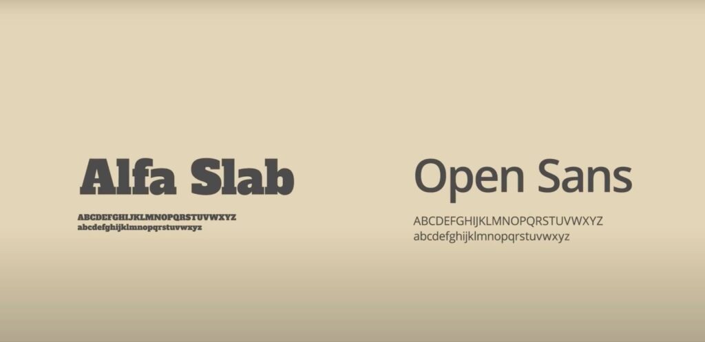
3. Open Sans & Playfair Display
Open Sans and Playfair Display are two popular fonts that offer a combination of modern and classic styles. Open Sans is a sans-serif font that has a clean and minimalistic design, while Playfair Display is a traditional serif font with elegant and decorative serifs.
Why It Works
- The contrast between the sans-serif and serif fonts creates a modern and traditional balance, making it suitable for various design styles;
- Both fonts have multiple weights and styles to choose from, allowing for flexibility in creating hierarchies;
- Open Sans’s simple and clean design pairs well with Playfair Display’s more decorative look;
- Both fonts are highly legible and work well for both body text and headings.
4. Poppins & Nunito Sans
Poppins and Nunito Sans are two modern and minimalist fonts that make a perfect combination for contemporary designs. Poppins is a geometric sans-serif font with a bold and clean design, while Nunito Sans is a rounded sans-serif font with a friendly and approachable look.
Why It Works
- The combination of two sans-serif fonts with different shapes and styles creates a visually interesting and dynamic design;
- Both fonts have multiple weights and styles to choose from, making it easy to create hierarchy in a design;
- Poppins’ bold and clean design complements Nunito Sans’s soft and round look;
- Both fonts have excellent readability and work well for both body text and headings.
5. Source Sans Pro & Merriweather Sans
Source Sans Pro and Merriweather Sans are two popular fonts that offer a harmonious and modern pairing. Source Sans Pro is a sans-serif font with a clean and elegant design, while Merriweather Sans is a modern and versatile serif font.
Why It Works
- The combination of a sans-serif and a serif font creates a modern and classic contrast, making the design visually appealing;
- Both fonts have multiple weights and styles to choose from, allowing for flexibility in creating hierarchies;
- Source Sans Pro’s geometric and modern design pairs well with Merriweather Sans’s elegant and versatile look;
- Both fonts are highly legible and work well for both body text and headings.
6. Raleway & Lato
Raleway and Lato are two popular sans-serif fonts that combine to create a clean and contemporary look. Raleway has a modern and minimalist design, while Lato is a versatile and readable font with a wide range of weights and styles.
Why It Works
- The combination of two sans-serif fonts with different shapes and styles creates a visually interesting and dynamic design;
- Both fonts have multiple weights and styles to choose from, making it easy to create hierarchy in a design;
- Raleway’s modern and thin design complements Lato’s more rounded and approachable look;
- Both fonts have excellent readability and work well for both body text and headings.
Tips for Choosing Google Font Combinations
Now that we’ve explored some popular Google font combinations let’s look at some tips that can help you make the best font choices for your designs.
1. Consider Your Design Style
When choosing Google font combinations, it’s essential to consider the overall style of your design. Different fonts evoke different emotions and messages. For example, if you’re designing a minimal and modern website, using a traditional serif font may not be the best choice.
Choose fonts that complement your design style and effectively communicate your message to your audience.
2. Stick to Two or Three Fonts
While Google Fonts offers an extensive library of fonts, it’s essential to limit yourself to two or three fonts in a design. Using too many fonts can create visual clutter and make your design look unorganized.
When selecting fonts, choose ones that work well together and offer enough variety in terms of weights and styles to create hierarchy.
3. Make Sure They Are Legible
Readability is crucial when it comes to choosing font combinations. No matter how aesthetically pleasing they may be, if they are not easy to read, they won’t serve their purpose.
Before finalizing your font choices, make sure to test them on different devices and in different sizes to ensure they are legible.
4. Use Contrast Wisely
As discussed earlier, contrast is an essential aspect of font pairing. However, using too much contrast can also be overwhelming. It’s important to strike a balance between contrast and harmony in your font combinations.
Combine fonts with varying weights, sizes, and styles to create a visually appealing yet cohesive design.
5. Consider Your Audience
Finally, when choosing Google font combinations, it’s crucial to consider your target audience. The fonts you select should appeal to your target audience and effectively convey your message.
For example, if your target audience is older individuals, using a font with small and thin lettering may not be the best choice. Consider your audience’s preferences and needs when making font choices.
Conclusion
Google Fonts is an excellent resource for finding high-quality and versatile fonts for your design projects. With so many options available, it can be challenging to choose the perfect combination for your design.
By understanding the basics of font pairing and following some tips for choosing fonts, you can create stunning designs that effectively communicate your message. Experiment with different Google font combinations and find the ones that work best for your project.